
What Makes a Website Actually Good
What Makes a Website Actually Good#
You do not need a design degree to know when a website feels "off." You can feel it in about half a second. The good news? You can build a site that feels great in that same half a second. Here is what separates a website people trust from one they click away from, in plain English, no jargon required.
Quick heads-up before we start: design is not decoration. Every headline, button, and photo is quietly making an argument for "yes, trust this" or "nope, next tab." Your job is to keep that argument landing in your favor.
People judge fast. Like, really fast.#
Here is the slightly scary part. People decide if your website looks good in about 50 milliseconds. That is faster than a blink. And that first impression tends to stick.
Then a second clock starts. Most visitors leave within 10 to 20 seconds unless your page makes its point obvious. In that tiny window, your homepage has to answer three questions:
What is this?
Who is it for?
Why should I care?
Answer all three near the top and you are golden. Bury them under a fancy "Welcome to our website" banner and people are already gone.
One more thing worth knowing: people do not really read websites. They scan them. Eyes skip around, grabbing headlines and the first few words of a line, then bouncing to whatever stands out. So write short headlines that carry the meaning, put your important words first, and let size and spacing point the eye where you want it to go.
The shape of a page that works#
A great page is not a random pile of stuff. It is more like a tiny story that walks someone from "huh?" to "okay, I'm in." The order usually looks like this:
The hook. Who it is for and the one biggest benefit.
Quick proof. A number, a logo, or a short quote. Something that says "this is real."
The payoff. What the visitor actually gets, in their words.
How it works. The steps, so the whole thing feels doable.
More proof. Stories, reviews, results.
The "but what about..." answers. Handle the doubts before they grow.
The ask. One clear button telling them what to do next.
The footer. The friendly map and contact info at the bottom.
Not every page needs all eight. But "hook, prove, explain, prove again, ask" is a great backbone.
The building blocks (and the traps)#
A website is made of a few repeating parts. Here is what each one should do, plus the mistake that quietly costs you trust.
The menu. Keep it to five to seven clear links, named for what people want. The logo should always link home. On a phone, tuck everything into one tidy menu. Skip mystery labels like "Solutions" or "Discover." If a visitor cannot guess where a link goes, the label flopped.
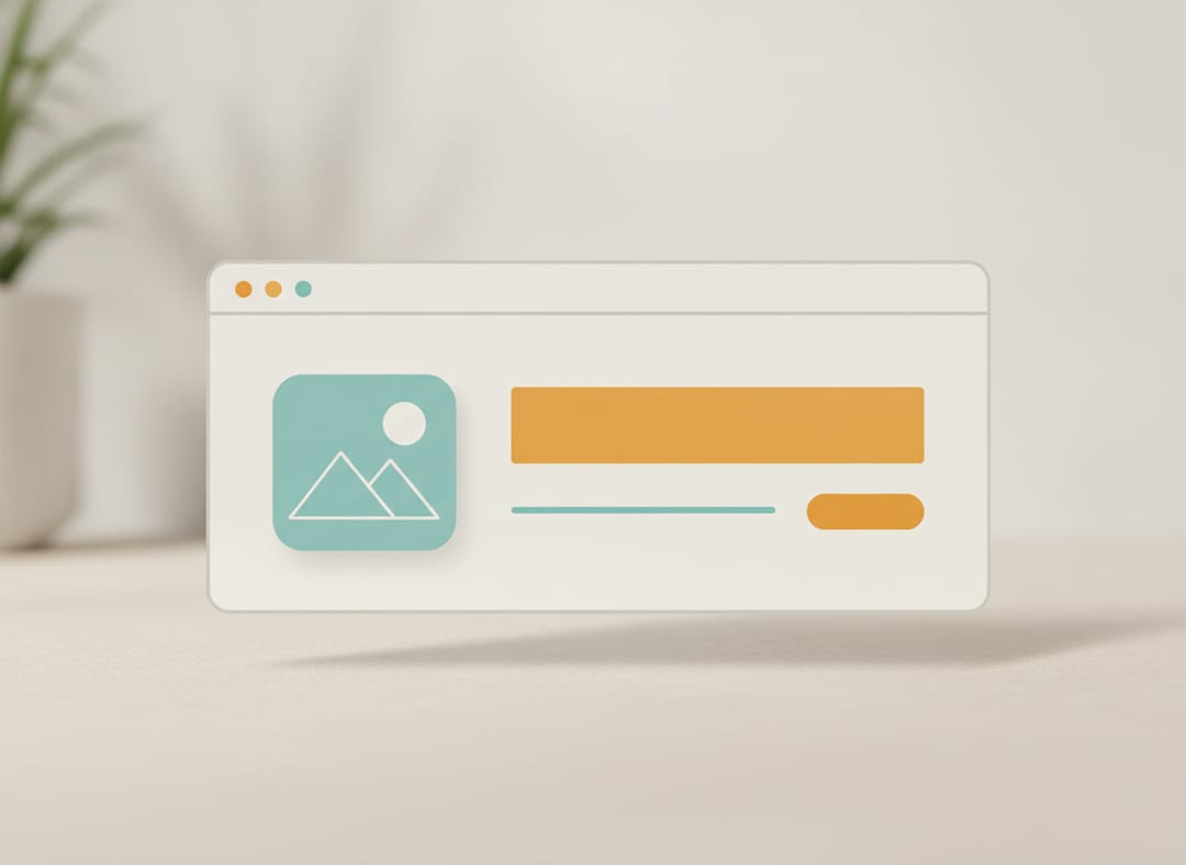
The hero (the big top section). One strong headline, one supporting line, one button, one great image. That is it. No wall of text, no five competing buttons, and please, no auto-spinning slideshows. People ignore those almost every time.
Your headline. Make it specific. "Fresh bread, baked daily, two blocks away" beats "Industry-leading baked goods solutions." Concrete always wins over clever.
Buttons. One main action per page, repeated as people scroll. Make buttons look like buttons (a bright, contrasting color helps a lot). Write them in the visitor's voice. "Start my order" beats "Submit" every time.
Real proof. Actual names, actual faces, actual results. A real customer saying "this saved me an hour every morning" is worth more than anything you could say about yourself. Anonymous "Great company!" quotes? People sniff those out instantly, and fake-feeling proof hurts more than no proof at all.
Numbers. A few big, specific numbers with simple labels do a ton of work. "12,000 orders delivered" feels solid because numbers are hard to fake. Just skip the sad little stat that makes you look smaller than you are.
Benefits, then features. Lead with what people get, then how it works. "Get found faster, your shop shows up on Google" lands better than a dry feature list with no "so what."
Forms. Every extra field you ask for quietly scares people off. Ask only for what you truly need, label things clearly, and add a little reassurance right by the button ("Takes under a minute. We never share your info."). Long, nosy forms are where you lose the people who were this close to saying yes.
Photos. Real photos of real stuff beat generic stock images every time. You know the ones: the staged handshake, the person laughing alone at a salad. Authentic pictures make a real business feel, well, real.
The footer. Treat it as the safety net. Contact info, helpful links, social, a privacy link. A lot of careful folks scroll straight to the bottom looking for the "real" details, so give them a reason to relax, not a lonely copyright line.
The stuff that runs through everything#
Some things are not one section. They show up everywhere, and they matter a lot.
Mobile first. A huge chunk of your visitors (often most of them) are on a phone. Design for one thumb scrolling a single column, then grow it for bigger screens. Make buttons finger-sized and keep the main action easy to reach.
Speed. If the top of your page does not show up in a couple of seconds, people leave before they ever see your hard work. Lean pages and right-sized images protect that all-important first impression.
Accessibility. Build it so everyone can use it: good color contrast, text descriptions on images, and pages that work with a keyboard. It is the right thing to do, it keeps you out of legal trouble, and bonus, it tends to help your search rankings too.
Be consistent. Same button style, same fonts, same spacing on every page. When things match, your site feels designed and dependable. When they drift, people feel "thrown together," even if they cannot say why. Consistency is mostly discipline, not budget.
Ten signs a site looks amateur#
A quick gut-check. If you spot these, you have some quick wins waiting:
A dated or cluttered look (judged in that first 50 milliseconds).
No clear point. Visitors cannot tell what they would gain.
Too many choices. People freeze and do nothing.
Hidden or vague buttons. The next step is a mystery.
Generic stock photos. Feels impersonal and forgettable.
No real reviews or faces. No reason to believe it works.
Mismatched buttons, fonts, and spacing. Reads as messy.
Long, demanding forms. Friction kills the sale.
A clunky phone experience. That is most of your visitors.
Not usable for people with disabilities.
The bottom line#
A great website does not come from one magic feature. It comes from doing the simple things well, over and over: make your value obvious fast, prove it with real people, ask clearly, and remove every little bit of friction.
And here is the part we love: you do not need to hire a fancy agency or learn to code to pull this off. With the right building blocks, you can do all of this yourself. (That is sort of our whole thing.)